6 Tricks To Optimize Your Android Application For Better UI.
Smartphones are the first thing that comes to mind when a person wakes up in the morning, this is the kind of reliability, we have on smartphones. Then there is the popularity of Android as an OS. Android applications are on the rise and they have been the popular choice of customers. Two important factors to an applications's success are, UX and UI. UX stands for User Experience and UI stands for User Interface. An application is as good as its UI that can deliver excellent UX.
74% of website traffic believes in returning to it only if it is optimized for mobile. According to the survey by DCI, two-thirds of mobile apps fail to hit the 1000 download mark in the initial year after launch and 24% of users abandon apps after the first visit. This shows the extent to which the optimization of applications for better UI is very important.
The initial design process is quite important to device a UI that can optimize the overall UX of users and make applications light, functional and easy on the eye. UI is an architecture of application that can be described as a structure of code built to have client-user interaction for the system. If the interaction is seamless and smooth, the UX level is increased, keeping the user-engagement to its highest.
So, let us explore 6 tricks to optimize an application on Android for better UI and in turn a better UX.
1. Ripple Effect:
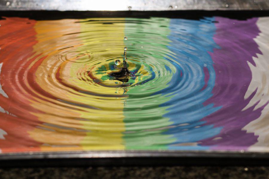
It is an instantaneous visual confirmation to the user who makes a contact with the system through UI components. Whenever the user clicks on a button, UI needs to provide a visual confirmation through user engagement. Responsive interaction encourages deeper exploration of an app by creating timely, logical, and delightful screen reactions to the user input, which should never be distracting to the user.
So with the release of the Android Lollipop version, Google introduced the RIpple effect based on material design. though you can use external libraries for the Ripple effect. We can get the Ripple effect in two different ways: one by using the RippleDrawables in programming class for Android or second is using XML drawable in response to the change in state.
2. Theme Based UI:
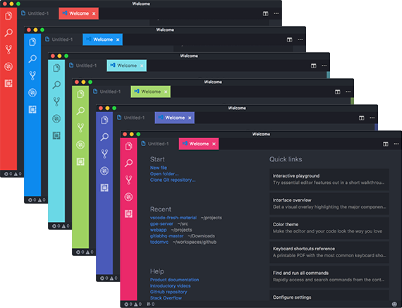
The Android platform provides a powerful componentized model for building your UI. These components are based on two components - View and ViewGroup. These two classes have pre-built components on Android for UI like layouts and widgets.
It is considered to be fruitful to stick with the platform based components to design your UI as it can integrate other behaviors like Ripple and Shadow in case of Android.
And yet if you feel to customize your UI based on your business needs, you can create your View subclasses or create subclass widgets or layouts and override its methods. You are in full control of your creation of View subclass with accuracy over the function of screen elements.
3. Elevator Property:
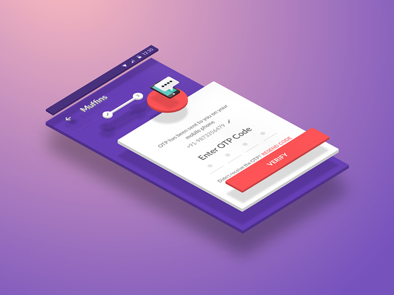
Elevation property in Material Design is measured as the distance between Material surfaces that is in non-technical terms layers of pages and other screen components. The distance from the one Material surface to another is measured along the z-axis in density-independent pixels and depicted by using shadows.
Elevation property can be used to optimize the UI by allowing the surfaces to move in front of and behind other surfaces, like content scrolling behind app bars. It can be used to define the spatial relationships between buttons and its shadows. These spatial relationships and shadows define buttons and pages layout important for the business point of view and that is the reason businesses hire programmers that can pay proper attention to the highest elevation like the appearance of a dialog in front of other surfaces.
4. Merger Manifest:
Manifest file mergers are necessary for the enhancement of UI and seamless UX through Gradle in Android that merges all the manifest files in a single package. This helps the smooth operation of the system UI and support for various libraries that are merged in the package. XML attributes that you have defined are used as merge preferences by the manifest merger tool that combines all the XML elements from each file.
5. ViewStub:
Android provides
6. Text SizeDP and SP:
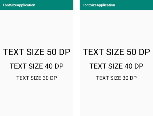
DP is a virtual pixel unit that you should use when defining UI layout, to express layout dimensions or position in a density-independent method. The density-independent pixel is equivalent to one physical pixel on a 160 dpi screen, which is the baseline density. DP units should be used when an application UI is defined, to ensure proper display of your UI on screens with different densities.
SP is similar to DP in any sense and is scaled for a user's font size preference. It is used for specifying font sizes for UI so that Users can set font size for both screen density and user preference.
Conclusion:
Though there are a lot of other tools like CTAs(Call To Action), Buttons and list views that can enhance your UI performance and optimize the application for a better UX. Above mentioned tricks are the most fundamental of tools for a UI developer to rely on and optimize the application design for better UI and provide enhanced UX.
About The Author
Related Blog
View All-
Top 5 Best Chatbot Apps of 2017 for Android Users
Chatbots have being here for a while and its use will be increasing in future as chatbots are easy to use and save plenty of time. Here are few of the must try Chatbot Apps which makes easy for people to accomplish certain tasks and save time. 1. Poncho – ...
-
Responsive Design in Android Apps: Tips for Every Screen Size
As mobile applications continue to grow, differentiating UI designs has become the most important part of improving the user's experience. Developers need to consider different screen sizes and resolutions when using custom mobile application development services. ...


