How the UX has changed dating apps
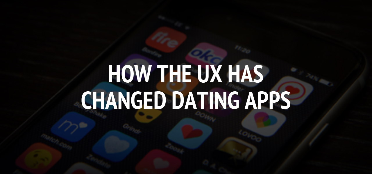
Statistically, more than 90 million people from all over the world use dating websites on an ongoing basis. What does this mean? This means that the majority of modern couples meet each other online but not in the cafes, parks, or nightclubs (as it was 10-15 years ago). People live and work online. Some of them simply have no spare hours to go anywhere and meet new people. Furthermore, they prefer meeting their soulmates online too. If to believe the statistics data, Tinder has more than 25 million matches per day. Therefore, we can make a conclusion that web platforms which help people find their love online are very popular today. Besides, when you use dating apps, your chances to meet someone online are higher.
In current times, to best serve users of these dating platforms, the apps started taking on similar characteristics. Their primary aim is to attract more users to dating platforms. Therefore, user experience has changed some features of dating websites. The key objective of this review is to guide you through the main changes.
Vertical feeds aren't popular now
You might know that Facebook or Twitter use vertical feeds to provide users with the latest updates. However, the latest studies proved that this form of data submission just overwhelms users with extra information. Some dating apps have adopted new features to make users feel more confident while using the service. For instance, Tinder started using the common card-based UI. As a result, users are less distracted, and they have not the slightest idea what is next.
Mobile apps are in demand today
Analyzing this industry, we can see that the majority of users prefer using dating apps which can easily be installed onto their mobile devices. As a result, a user is online round-the-clock. Therefore, they can answer calls, use chat dating options, or write messages on an ongoing basis. The desktop versions also exist, but they are less popular than mobile apps.
Navigation is easier and faster
If a user downloads a dating app, it means that he/she wants to meet someone online. Therefore, a user shouldn't spend a few hours to understand how to use this app. The majority of modern designers understand this issue and try to build a website allowing users to make fewer movements to use this or that feature.
No fear of rejection
Keep in mind that the main fear of the majority of users is the fear of rejection. Having got one or two, a user can leave this dating app and won't come back here anymore. The website developers eliminated this fear. Now, users are notified of only mutual matches. Simply put, you will hear only "yes" from dating apps.
The right color scheme
You might know that dating is based on emotions. Therefore, except for a broad selection of features a dating app has, users also pay attention to the color scheme. Keep in mind that this is the first step which can impress the users of this particular platform. If to have a look at the modern dating sites, we see that minimalism is the main trend today. The main colors of dating sites are red, pink, yellow, or blue.
Linking different platforms
The majority of dating platforms allow users to link social media profiles to dating apps. You just need to login via Facebook, and the platform will immediately show some users with common interests. Besides, it was proved that users trust more the dating websites allowing them to link their social media accounts.
Dating platforms try to cater to the needs of users today. Their goal is to make the user experience as pleasant as possible. Considering the number of users of online dating platforms, they managed to achieve that goal.
About The Author
Related Blog
View All-
The feature of deep linking in various types of in app notifications
Developers and marketers of mobile apps may successfully communicate with their users by sending them in-app alerts. The ability to leverage deep linking in different types of in app notifications is crucial, as it enables users to quickly and easily access relevant ...
-
5 Best Football Prediction Apps in 2020
Football is undoubtedly the best sport for entertainment thanks to the 90-minutes long watch alongside the suspense, the unpredictable, the unexpected it offers in that time frame to make it possess almost all the quality a cliffhanger cinematic movie should have. In ...


