How to Design Search for Your Mobile App?

Google has redefined the way you search for information. From accessing different books and encyclopaedias while sitting in the libraries for long hours, today, you can manage to get the information by typing in the right keywords in the Google search. Search has become popular enough that it has become a part of the mobile apps as well. The search bar element has suddenly become important in mobile apps. We are going to discuss the search functionality, its importance, and how to design a good search engine based on the type of app you have.
Why design search for mobile apps?
60% of the users interviewed by Kissmetrics claimed they preferred on-page navigation as against the search option to find product information management (PIM).
47% of these respondents preferred filter down option to reach their specific product.
These respondents were more accustomed to searching for products online via desktop, which led to these preferences. However, using the same search methods on mobile can be slightly difficult.
The mobile share for organic search engine visits from the U.S. in the first quarter of 2019 alone is 59%
With the growing number of smartphone users preferring to search for products either on a mobile website or the mobile app, it has become important for app developers to consider certain best practices that can help with the search.
You may ask what type of apps generally require a well-designed search bar?
- The content-driven apps like a news app, a blog, etc. where you need to look for specific content
- The e-commerce store apps with various categories to explore
- The listing sites such as apartment rental sites, hotel search sites, etc.
Exploring these sites is made easy if you have the right kind of search bar designed for them.
The Two Types Of Mobile App Search
You now know why mobile app search is important; however, designing it is an altogether different ball game.
There are two options available:
- The full-width search bar that is prominent at the top
- The tab-type search bar that is present at the bottom along with the navigation bar
We will explore both the options one-by-one to understand the major differences, and how they can help you with what you are planning the mobile app UI.
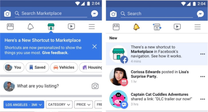
Full-width Search Bar: You may have used Uber, Facebook, and even the food apps like Zomato. These apps showcase a full-width search bar at the top, which means the first function they are offering to you is search. These are apps that the users enter with an intent to search and look for the options available. For instance, you want to look for cabs in the vicinity, and search is the first thing on your mind when you enter the Uber app. Similarly, for Facebook, you may have some person in your mind, and want to search for their profile. When the intent is search, you should ideally opt for the full-width bar.

Tab in Navigation Bar: When the search is used to improve the engagement levels within the app, then you should use the tab-like search in the navigation bar. For instance, most of the Instagram users hop onto the app just to explore and view the latest posts. The search comes as an afterthought to these people. Similarly, the first intent of the users visiting the hotel or other listing sites is to explore the options, and then search for the type of hotel or place they are finding. They don't come with search as their first intent.

Certain applications tend to use a mix of both the search types, i.e., full-width tab as well as the navigation tab. These are apps that can be visited by users that have both purposes on their mind, i.e.,
search-first or explore and then search.
A lot of apps, of which Youtube is one, prefer not including the search tab in the navigation bar. They use a separate menu with a magnifying glass, at the top of the app, to showcase the search feature of the app.
Now that you know the search bar design, you need to narrow down the search design to the results.
Search Bar Results Design
Along with where to place the search bar, it is important to note how users can search with your app, and how the results will be displayed.
-
Regular Search Option: What the user types in the search bar helps the mobile app deliver the search results. For instance, the user searches for Mobile app design, and then the search results will vary from types of mobile apps to the best practices related to mobile app design. This is a high-cost interaction for the mobile app developers, and it is best to avoid this type of search. For one, if the answers are not relevant after multiple searches, the user may abandon the app. It definitely works for a certain app but, not for apps that thrive on engagement
-
Advanced Filtering for Search: If your app is one that includes large numbers of products and invests in various categories, then you should offer a filtered search option. This is true for Amazon, as it has invested in a wide range of products for the users to choose from. For instance, you can look for the products you want, then filter out the options that you don’t want to be displayed, thus narrowing down your search to the product that interests you. This will not just increase conversions, but also help with engagement
-
Auto Suggestions in Search: If the user types a particular keyword, your search engine should start predicting the type of product or service the user is looking for. For example, if someone has typed in One Plus in the search bar, then your auto-suggestion feature should showcase the different options like “One Plus 7 Pro”, “One Plus 7 Pro Nebula Blue” etc. This will help minimize the input for the product, and help users with immediate results
-
Recent Searches: A search made in the past may help the user with their current search. This will help them get the results they desire. So, a saved search should be added to your search result design. It will help them know the query they had in the past, thus saving time in the next search.
The search bar design should also opt for voice-based search so that it is accessible and inclusive for the users. Make sure to have this feature included in your app.
Summing up
Search bar design is an important aspect of mobile app UI design. You cannot ignore it or, design it half-heartedly, as search helps with increasing user engagement on your page.
The key takeaways from here include:
- You should design a prominent search bar or a search navigation tab based on the end goal of search in your mobile app
- You can also use the magnifying glass icon for search at the top to indicate the provision for search in your mobile app
- You should ideally design the search results as well, to complete your mobile app search design.
It is important to have a goal in mind before you begin designing the search for your mobile app.
About The Author
Related Blog
View All-
Keys to Make an Amazing Business Based On an Application
When it comes to your small business, does it appear like you’re treading water progressing towards your goals? Of course, every entrepreneur wants to have a profitable and successful business, but how to get there is not always clear. Indeed, times have ...
-
10 Must-Have Apps for Your Amazon FireStick
Turn your TV into an entertainment hub with the Amazon FireStick. This device has thousands of apps. But which ones are the best? Let’s look at ten must-have FireStick apps. They include binge-worthy shows and live sports. These selections have something ...


