
The Difference In Designing IOS And Android Apps
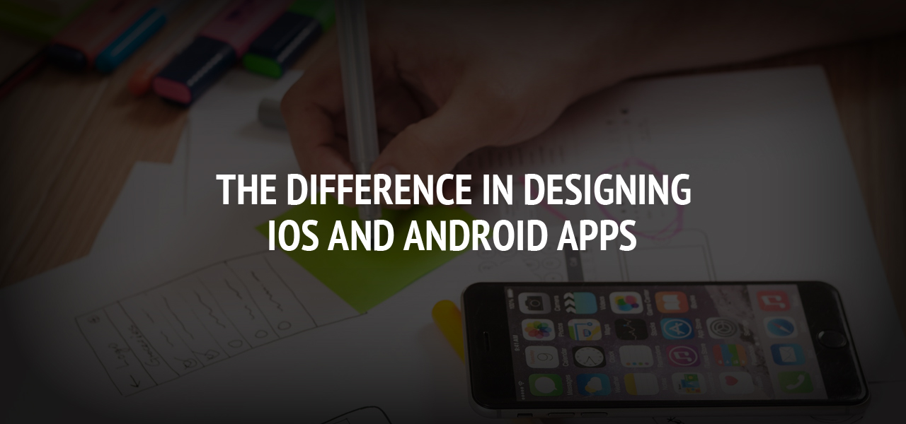
The role Apps play in this modern age, where over two-point-five billion people own smart-devices cannot be overemphasized. Almost all smart-device owners carry their devices with them regularly throughout the day. These devices help us with our day to day activities, which range from mundane tasks like helping us wake up every morning to more complex functions like helping us keep track of the stock market.
A mobile application commonly referred to as an App is a software that is created to run on a mobile- device such as your phone, watch, or tablet. The IOS apps are mostly based on Human interface Guidelines with three major themes that include depth, clarity, and deference, while that of the Android app conform to Material Design with an emphasis on the real world and it's textures.
The IOS and Android Apps combined take up over ninety-five(95) percent of the App market; hence, it is essential to note the differences when it comes to designing specifications for these widely-used apps.
#1 Icon Shapes
Android app icons can be designed with any shape in mind, the icons are permitted to have transparent backgrounds, and the use of paper shadows; as opposed to IOS icons which take on one shape which is a Squircle shape (square shape with rounded corners), the icons are not permitted to have transparent backgrounds and the icons usually have a flat style.
#2 Typography
The two systems have different fonts. The IOS has a San Francisco font while Android has a Roboto. The San Francisco has two versions which are the San Francisco Pro text and San Francisco Pro display. The SF Pro Text is used for texts that are 19 points or less, while the SF Pro Display is for 20 points and above.
As a developer, you will need to take into account the different typographies when designing apps for each platform.
#3 Different Navigation Features
As a developer, you must note that Android and IOS have different standards/guidelines when it comes to the navigation pattern. The standard Android apps have a navigation bar located at the bottom that is built-into the graphical user interface; while the standard IOS apps do not.
On the standard android navigation bar from the left is the 'back button' that helps you get back to a previous page, the 'home' button that allows you to get back to the home screen with one click, and the 'recent' button that will enable you to see all the recent apps opened on your device.
On the standard IOS app, to navigate to a previous page, you have to either swipe right or use the back button, which is usually located at the top left corner of a page.
#4 Touch Targets
The IOs and Android have different specifications when it comes to touch targets. The touch target for Android is 48dp/48px@1x, while that for IOS is 44px@1x.
#5 Grid Specifications
IOS apps usually conform to multiples of 4pt, and 5pt spacings and sizes, although IOS has no specific guidelines for grids meanwhile; Android guidelines for the material designing requires particular grids. The grids are 8dp and 4dp grid. The 8dp is required for multiple/general purpose, while the 4dp is needed for the alignment of icons and types.
#6 Tab Placements
The standard Android tabs are usually contained in a drawer menu, which can be accessed via a button placed at the left upper corner of your screen where the user has access to the different options the app has to offer. IOS tabs, however, are not placed in any drawer, the tabs are mostly visible at the bottom of the screen and rarely anywhere else.
#7 Vocabulary
The vocabulary used to define bars on both platforms are different; therefore, as a developer, you should be conversant with the names.
#8 Screen Sizes/Densities
Android has a lot more screen sizes/densities when compared to IOS. Android has 1x,1.5, 2x, 3x, and 4x resolutions as opposed to IOS, which has just 2x and 3x resolutions. This is because IOS has one manufacturer when compared to the numerous manufacturers of Android.
The density-independent pixel (DP) is the primary unit of measurement for Android, while IOS uses points. One point is equivalent to One Pixel on a standard resolution screen.
Conclusion
When your app design is ready to be executed, you will have to keep in mind these differences when exporting the assets to the different platforms because the elements of the interface look different on various screens.
The above list is a good starting point for those you want to learn the peculiarities of designing apps for the different platforms; however, it is not an exhaustive list. Taking note of these differences will aid you, the developer, in understanding how similar tasks can be executed on both platforms. The consumer's preference is the most crucial factor.
About The Author

Related Blog
View All-
Mobile Apps You’ll Need To Run Your Business From Your Phone
Running a business used to involve renting an office and employing countless other services in addition to your workforce to cover accounts and HR, to name just a few. This all added up to a lot of expense and not only discouraged many budding entrepreneurs but ...
-

FaceApp Challenge, Neural Networks, and Implications for Digital Marketing
The emergence of the internet of things concept has completely changed the way companies, both small and large, conduct their business operations and market their goods and services. In a world where everybody is interconnected via their phones and other computing ...


